Client
N26 (via CIF)
Year
2023 — 2024
Category
B2C, Fintech
Platform
Mobile
Retail investing has grown quickly, especially among younger, mobile-first users. In Germany, many people were entering the market for the first time, often with small amounts, limited experience, and high expectations for usability.
At the same time, trading introduces real risk, legal constraints, and emotional pressure. Poorly designed interfaces don’t just confuse users, they can lead to costly mistakes.
N26’s challenge was clear:
How do you design a trading experience that feels simple and approachable, while remaining accurate, compliant, and safe?
I worked as a Product Designer within a cross-functional team of designers, product managers, engineers, data specialists, and compliance stakeholders.
My design squad
Our focus was on the core trading experience:
Designing core trading domains: Assets, Orders, Portfolio, Order Management, and Tax
Translating research and regulatory constraints into usable, scalable UX pattern
Facilitating workshops to align teams around users, priorities, and trade-offs
Defining UX principles that guided decisions across the product
Contributing to design system extensions (icons, illustrations, motion, reporting templates)
Research showed a clear pattern: users felt confident downloading a trading app, but far less confident once real money and real decisions were involved.
Many users wanted to invest gradually, often fractionally, and learn along the way, without feeling rushed, manipulated, or overwhelmed by financial jargon.
Bridging the gap between access and confidence became a central design goal.
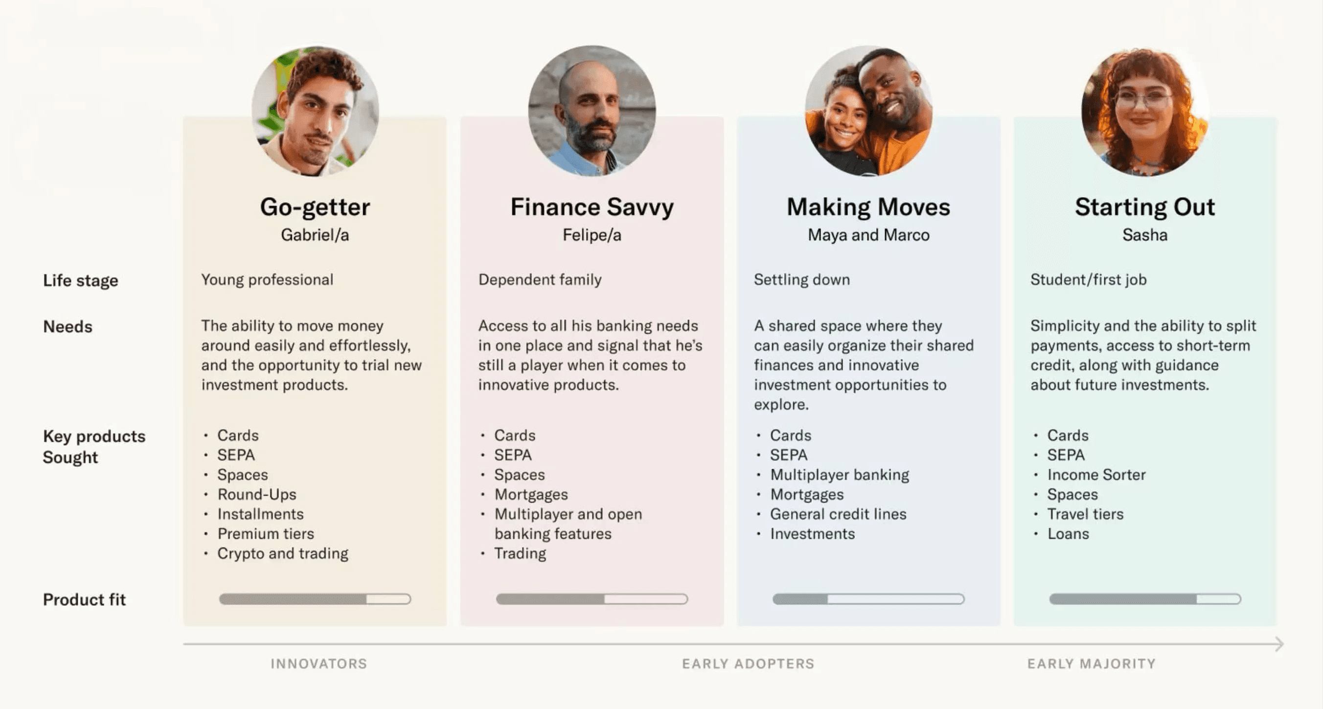
N26 user personas
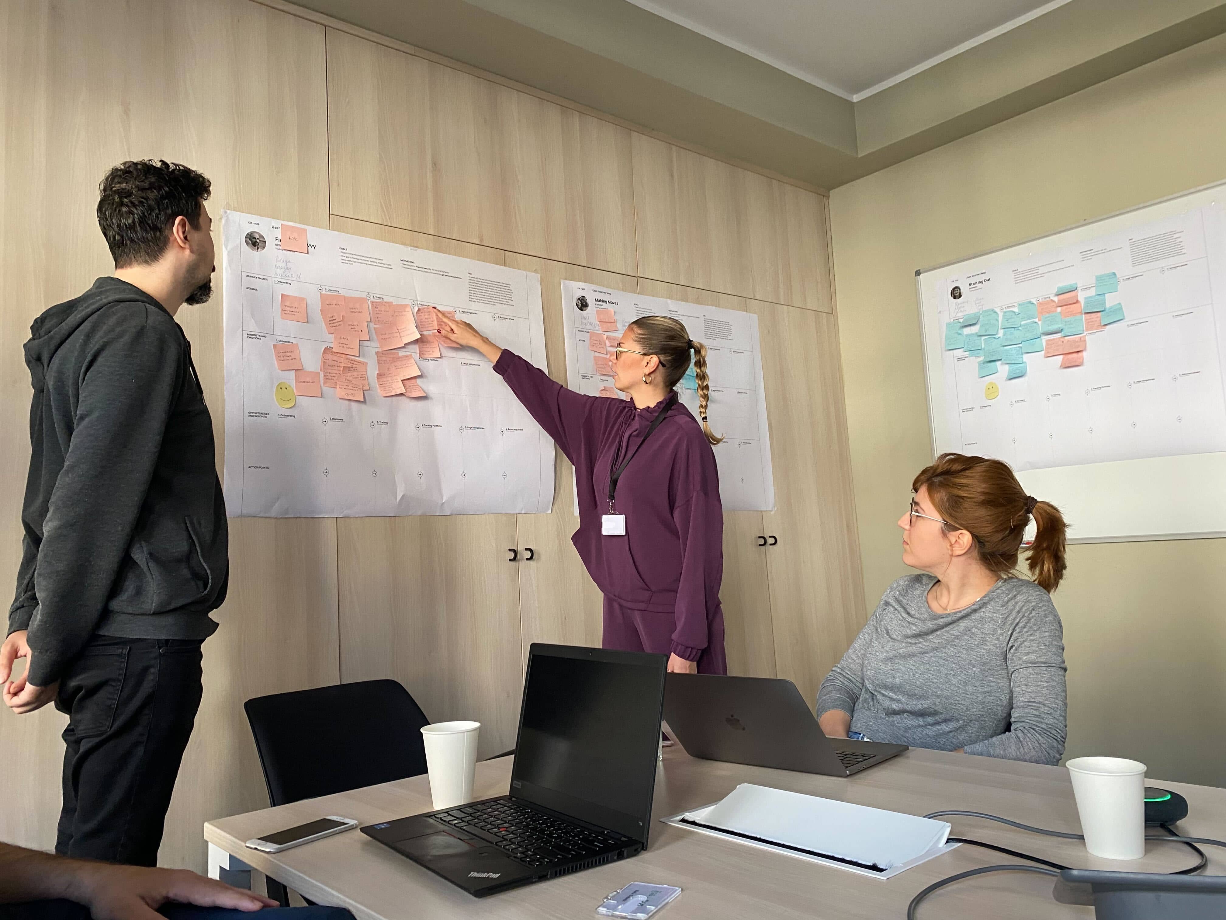
Journey mapping workshop
Based on research, workshops, and stakeholder input, we defined three core UX principles that guided all design decisions:
Clear
Reduce noise. Prioritise information. Use language people actually understand.
Easy
Reuse familiar N26 patterns so trading doesn’t feel like a separate product.
Safe
Slow users down at the right moments. Be transparent about costs, risks, and consequences.
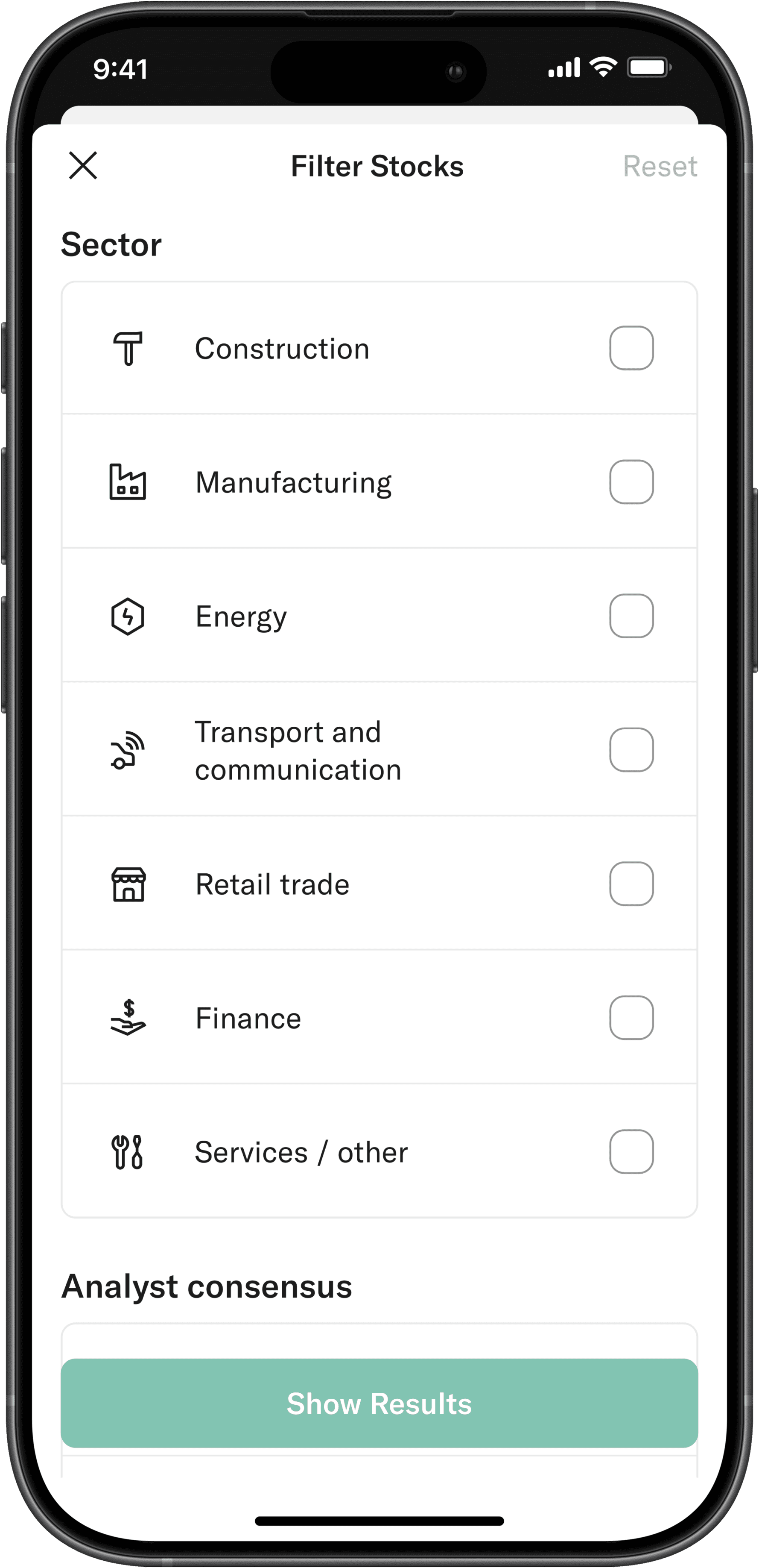
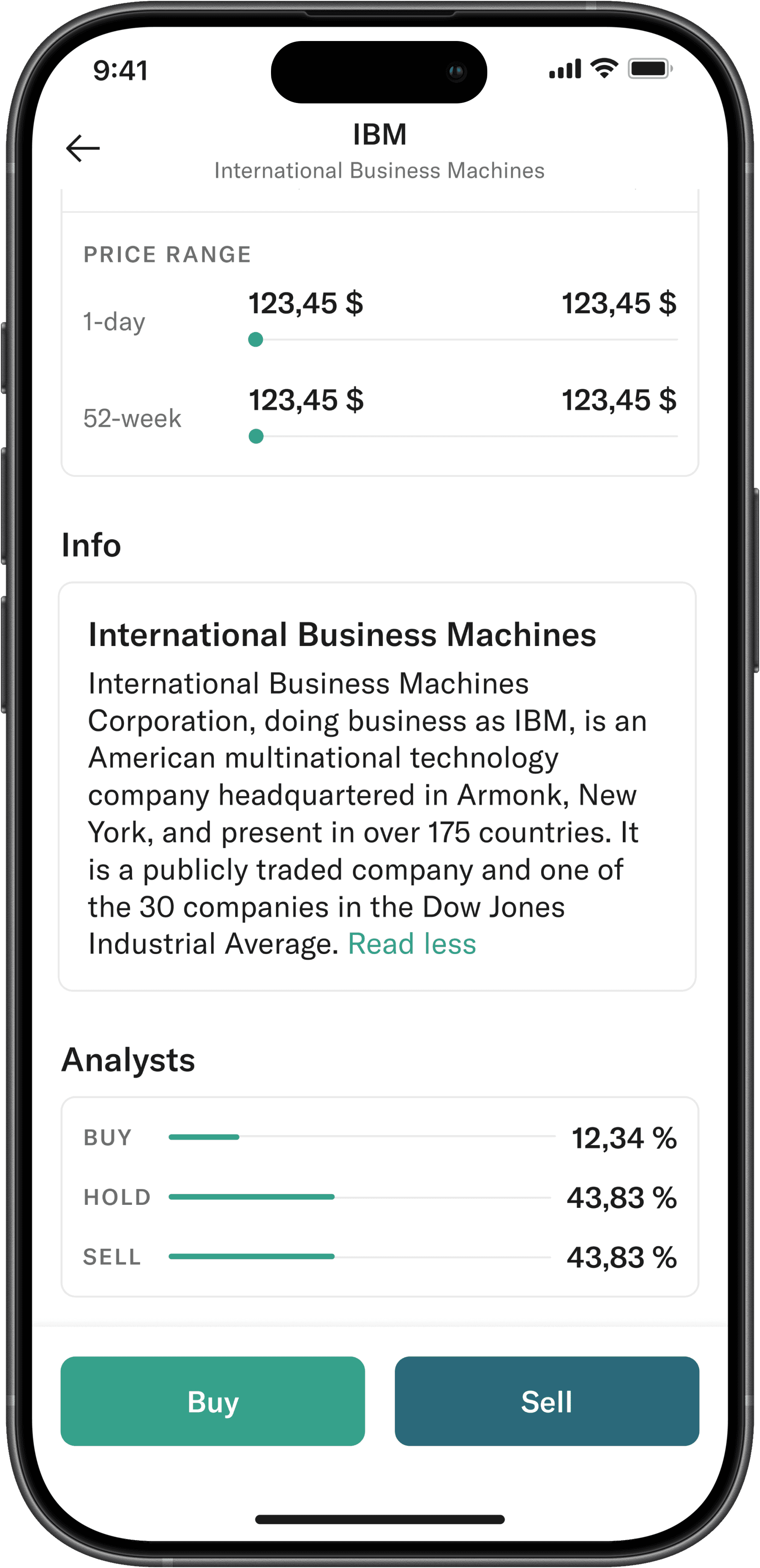
Asset screens are where curiosity turns into intent. They need to answer “What is this?” and “What’s happening?” before asking the user to act.
We focused heavily on hierarchy — price, performance, and trends first; deeper metrics second. Detailed information was available, but never forced.
Buy and Sell were given equal visual weight to avoid nudging users toward impulsive decisions.
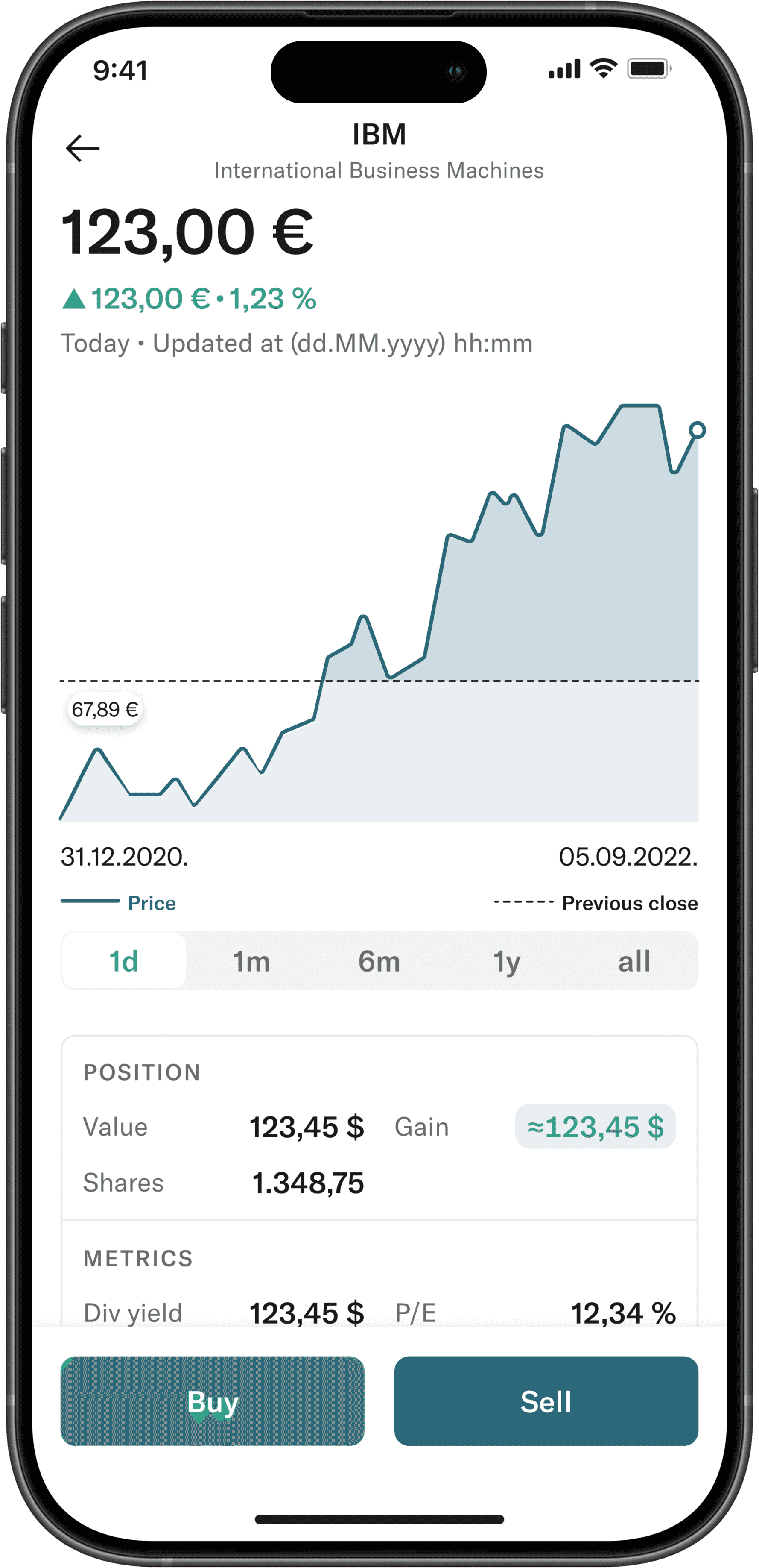
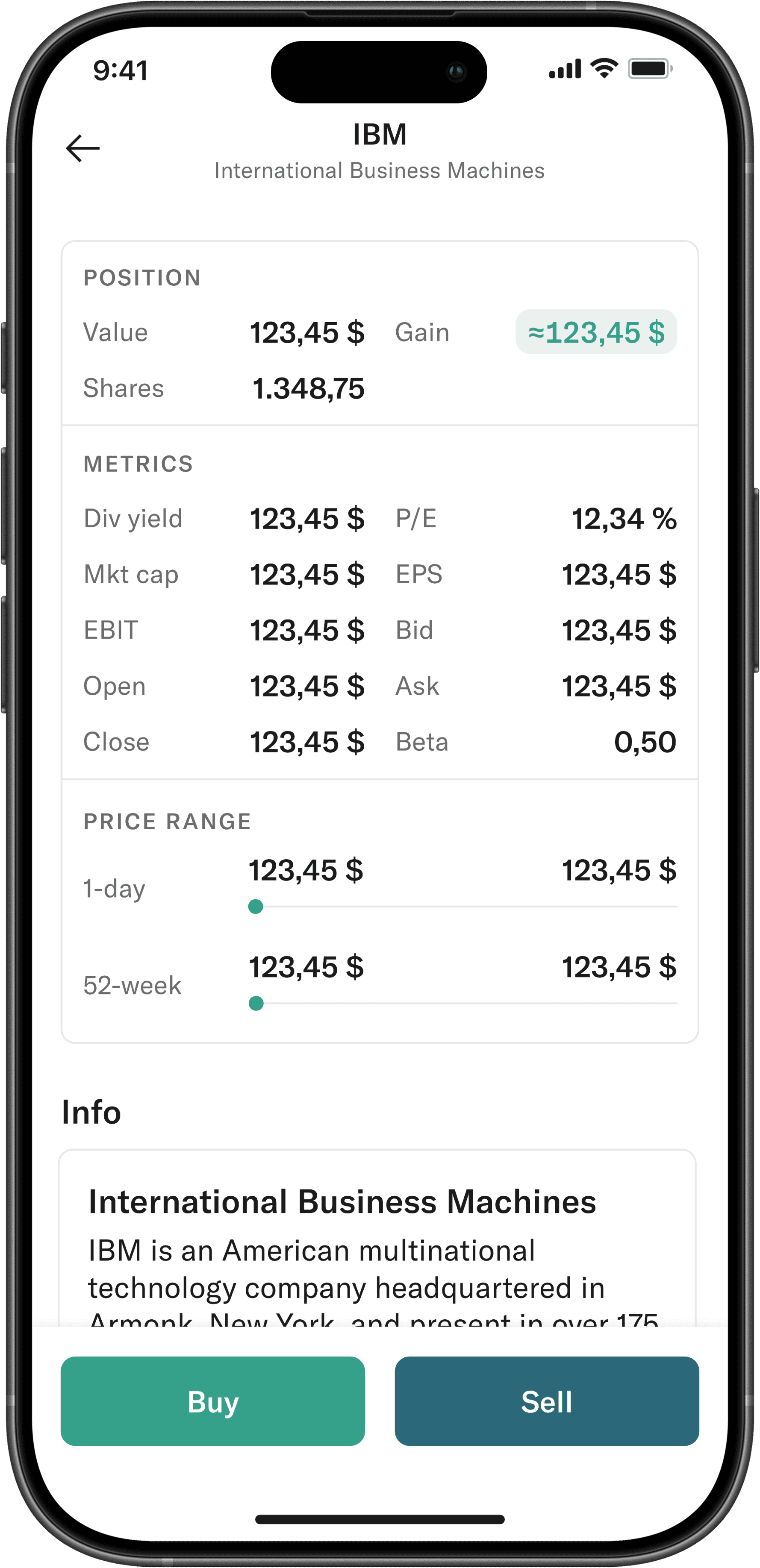
Asset details
Outcome: Users can understand an asset’s state at a glance, while still having access to deeper metrics when needed.
Placing an order is the most sensitive moment in the experience. Mistakes here cost real money.
Instead of exposing every possible order type, we limited the experience to the ones that mattered most. We added friction on purpose (confirmations, context, and clear summaries) to help users pause and think.
Speed mattered. Accuracy mattered more.
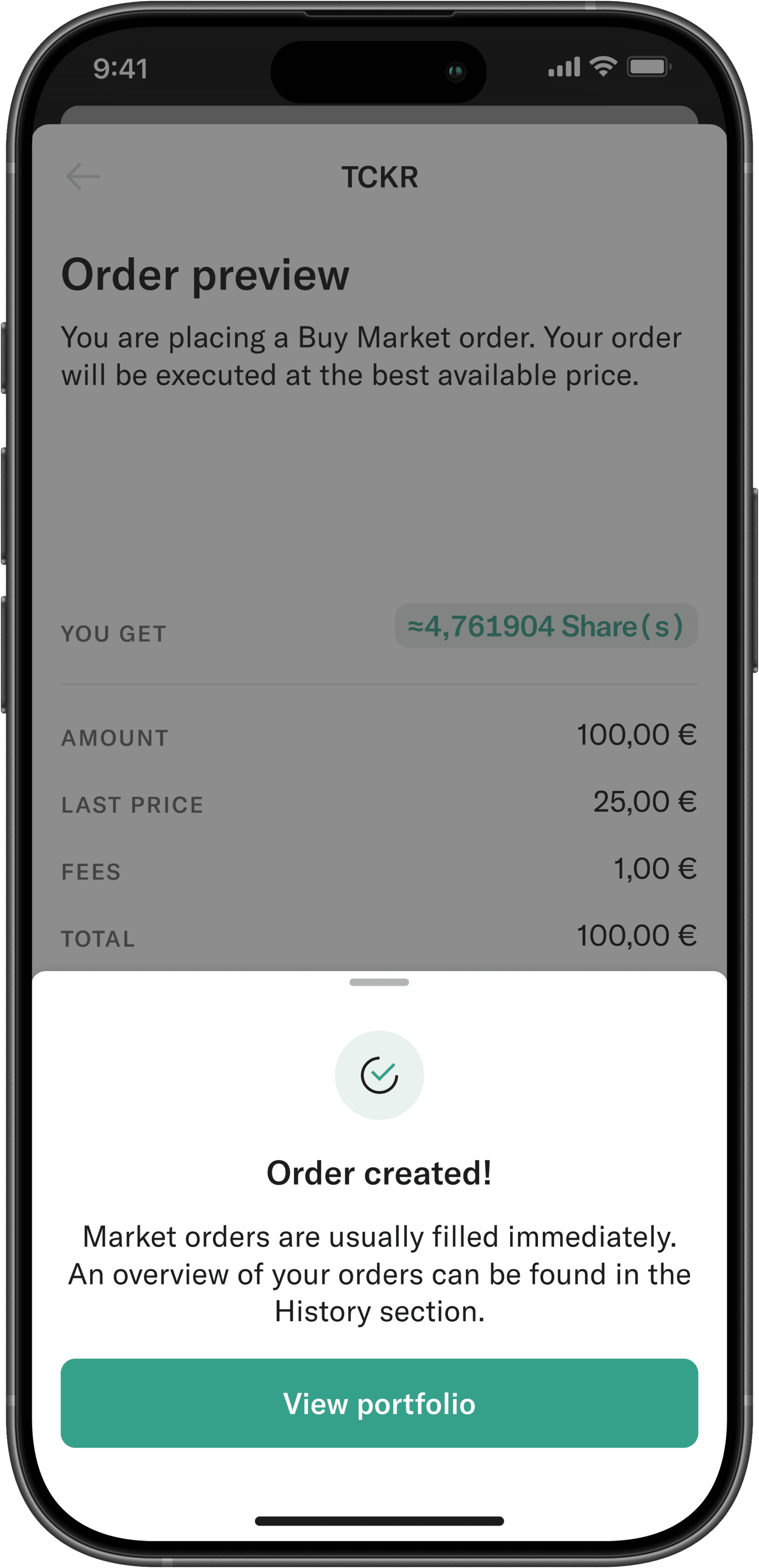
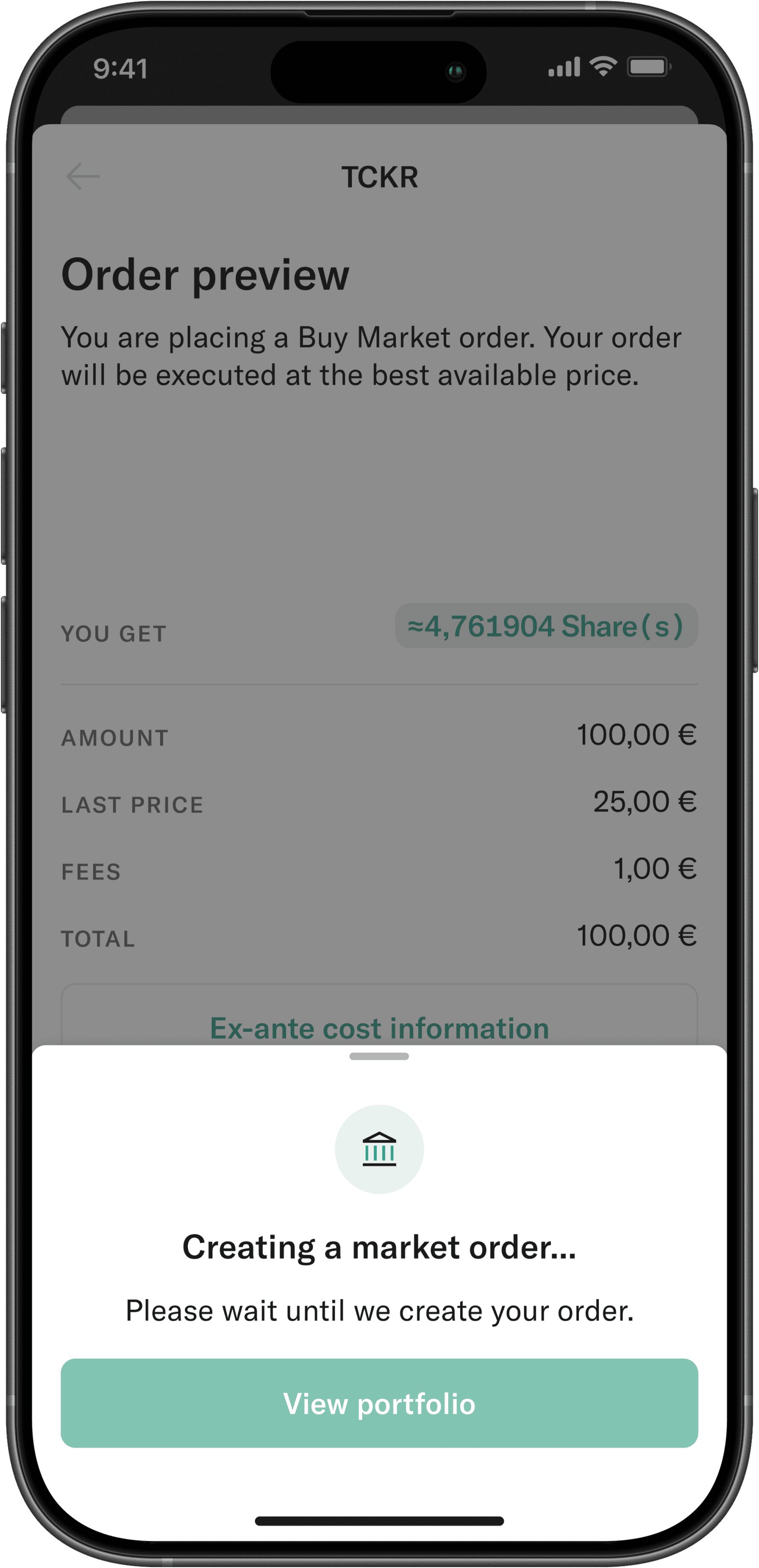
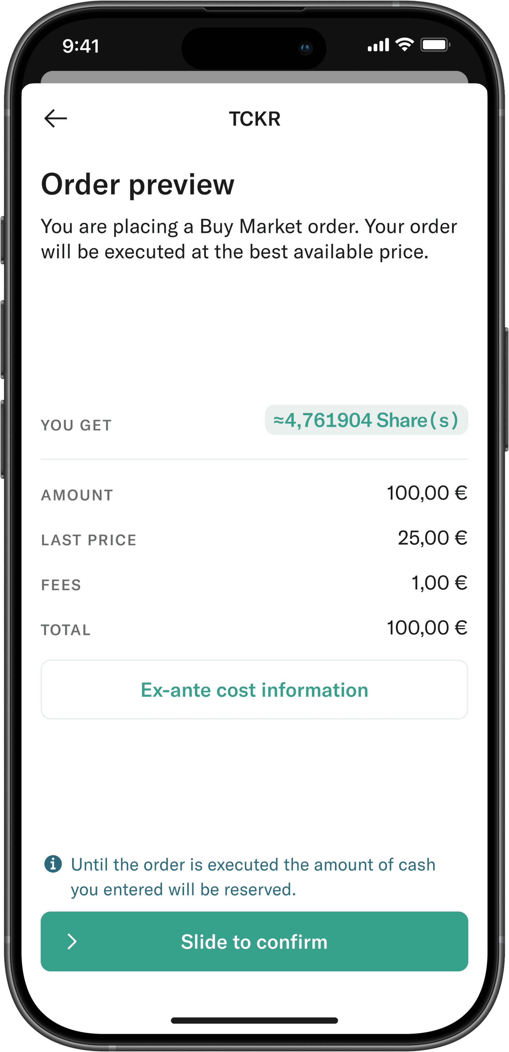

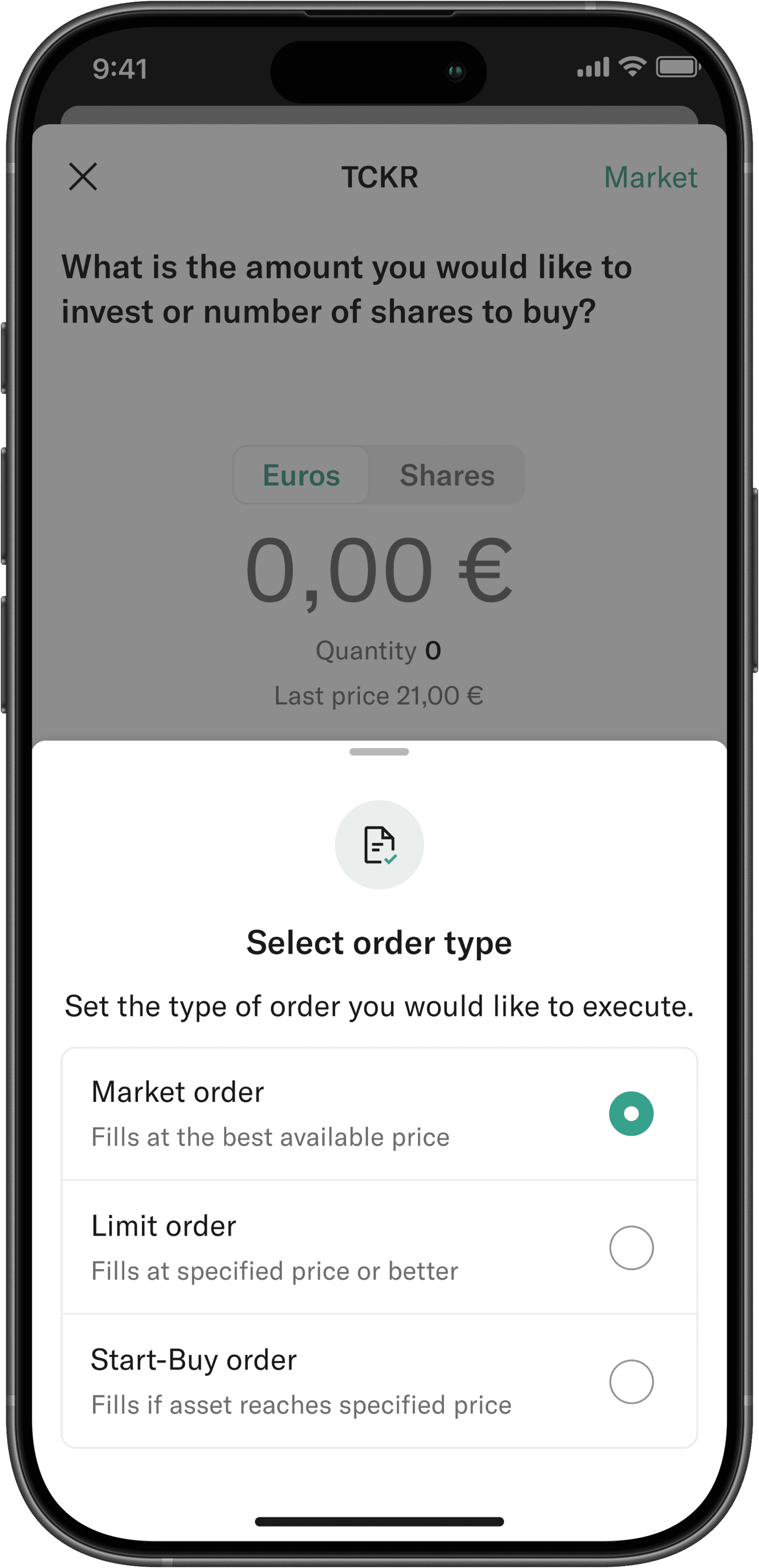
Buy flow (stock)
Outcome: Order placement feels fast and flexible, while still protecting users from costly mistakes.
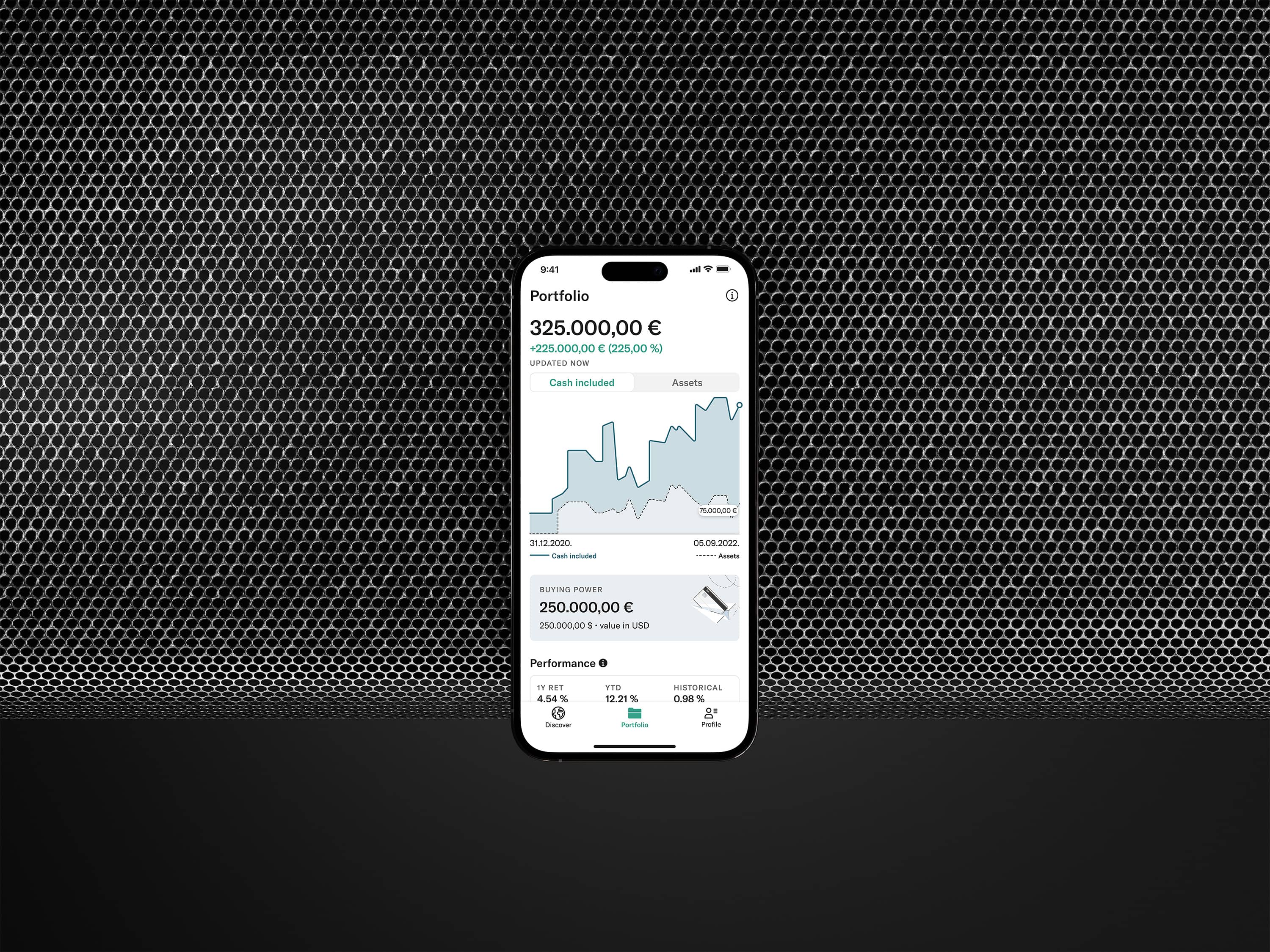
Portfolios are emotional. People check them often, sometimes too often.
We designed portfolio visuals to be readable at a glance, accessible, and honest. Color was used carefully, legends were simplified, and smaller positions weren’t allowed to disappear visually.
The goal wasn’t to gamify performance, but to make it understandable.
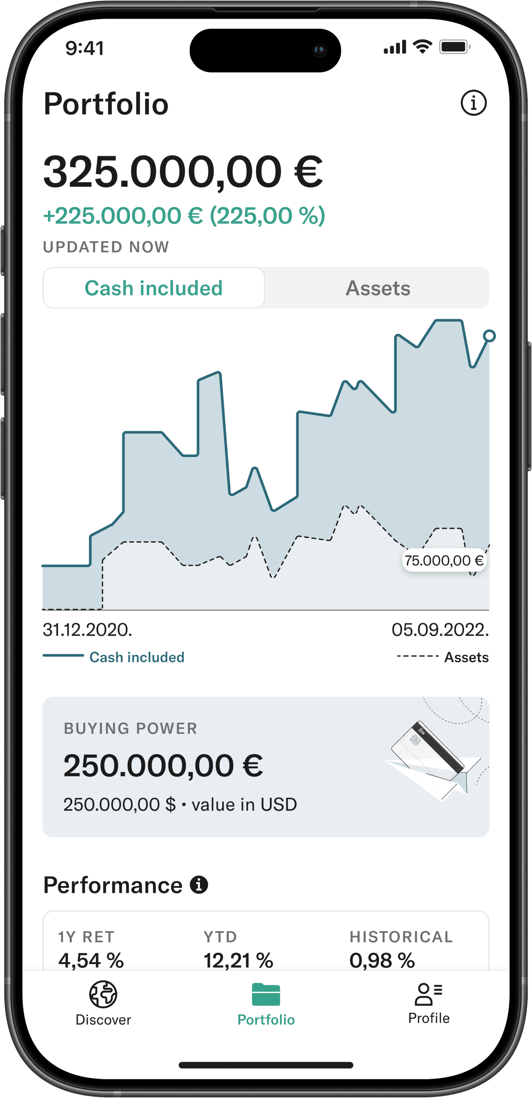
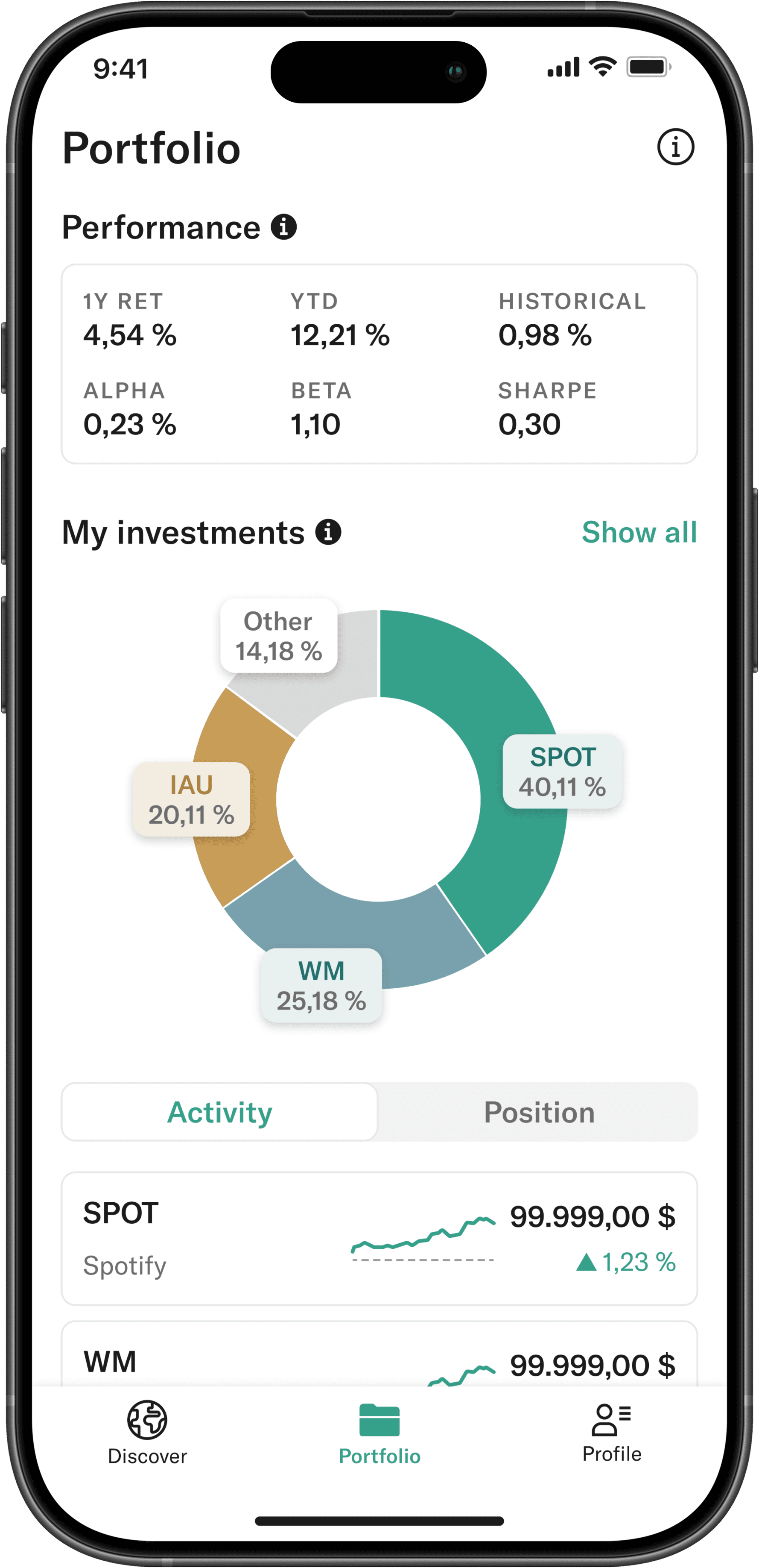
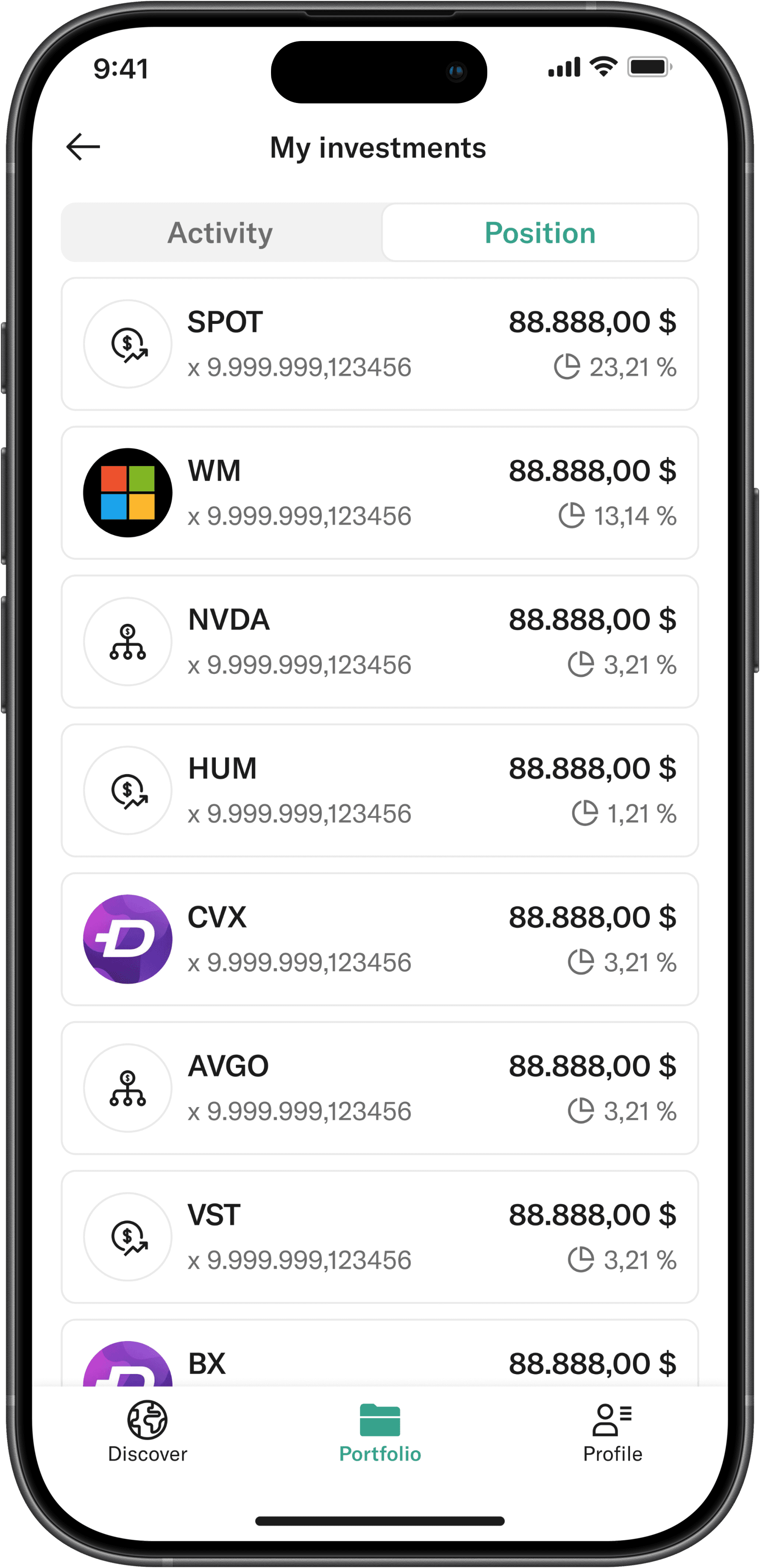
Portfolio & investments
Outcome: Users gain a clearer overview of their investments without losing important context.
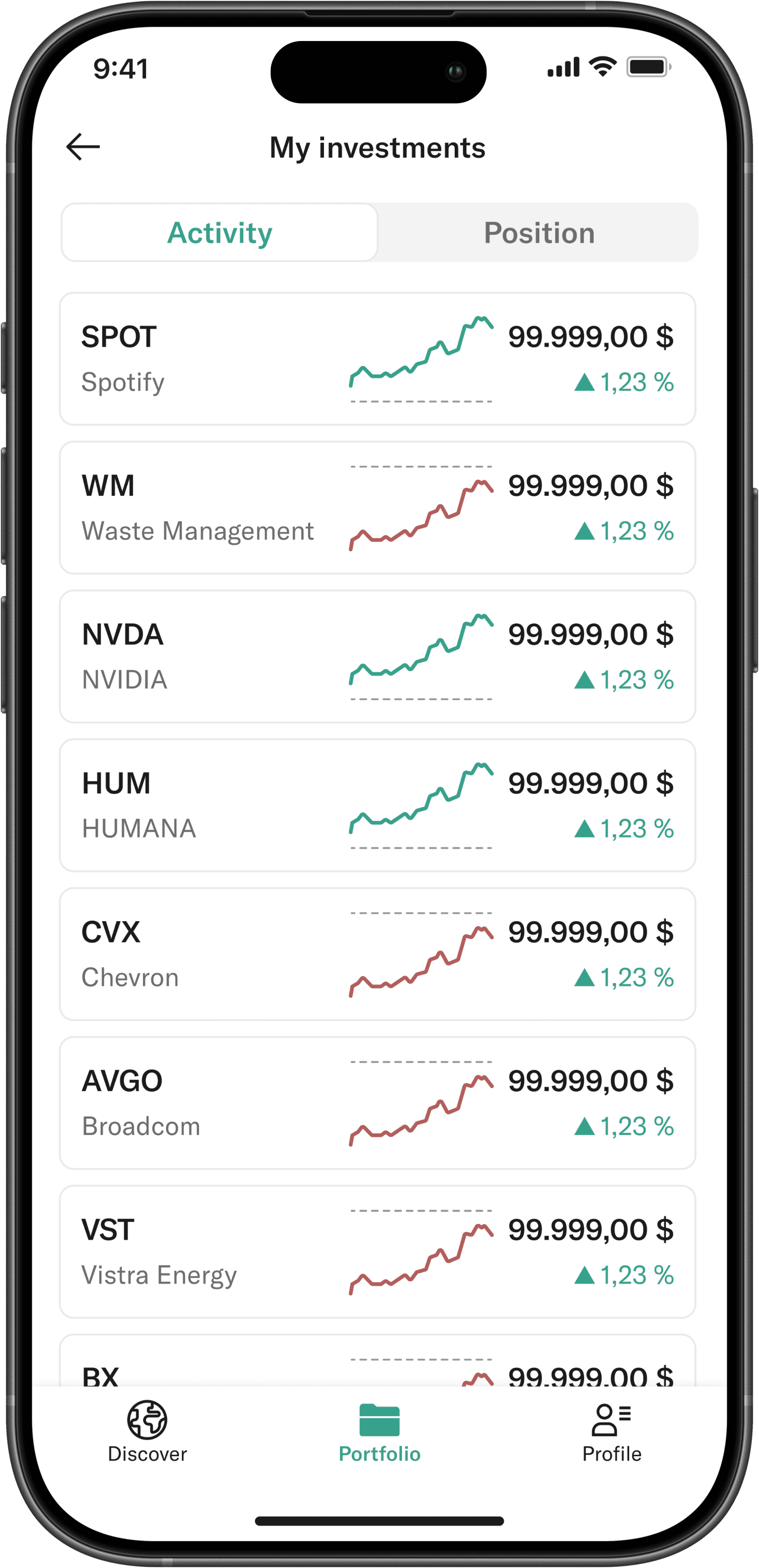
Order history acts as the single source of truth for everything that has already happened.
Instead of treating it as a passive log, we designed it to clearly communicate status, outcome, and context at a glance.
Pending, completed, and failed actions are visually distinct, and empty states are used to set expectations rather than feel like errors.
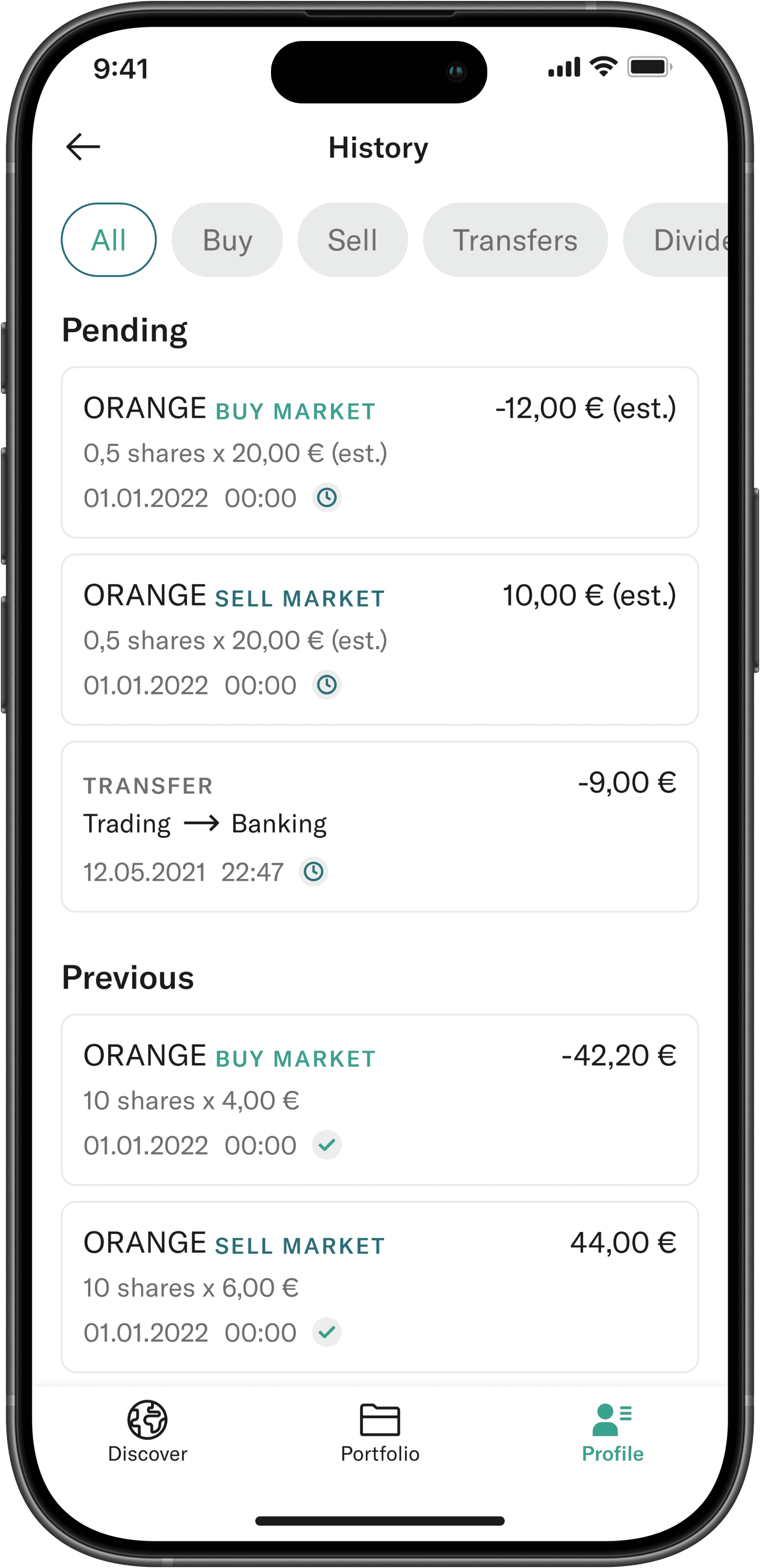
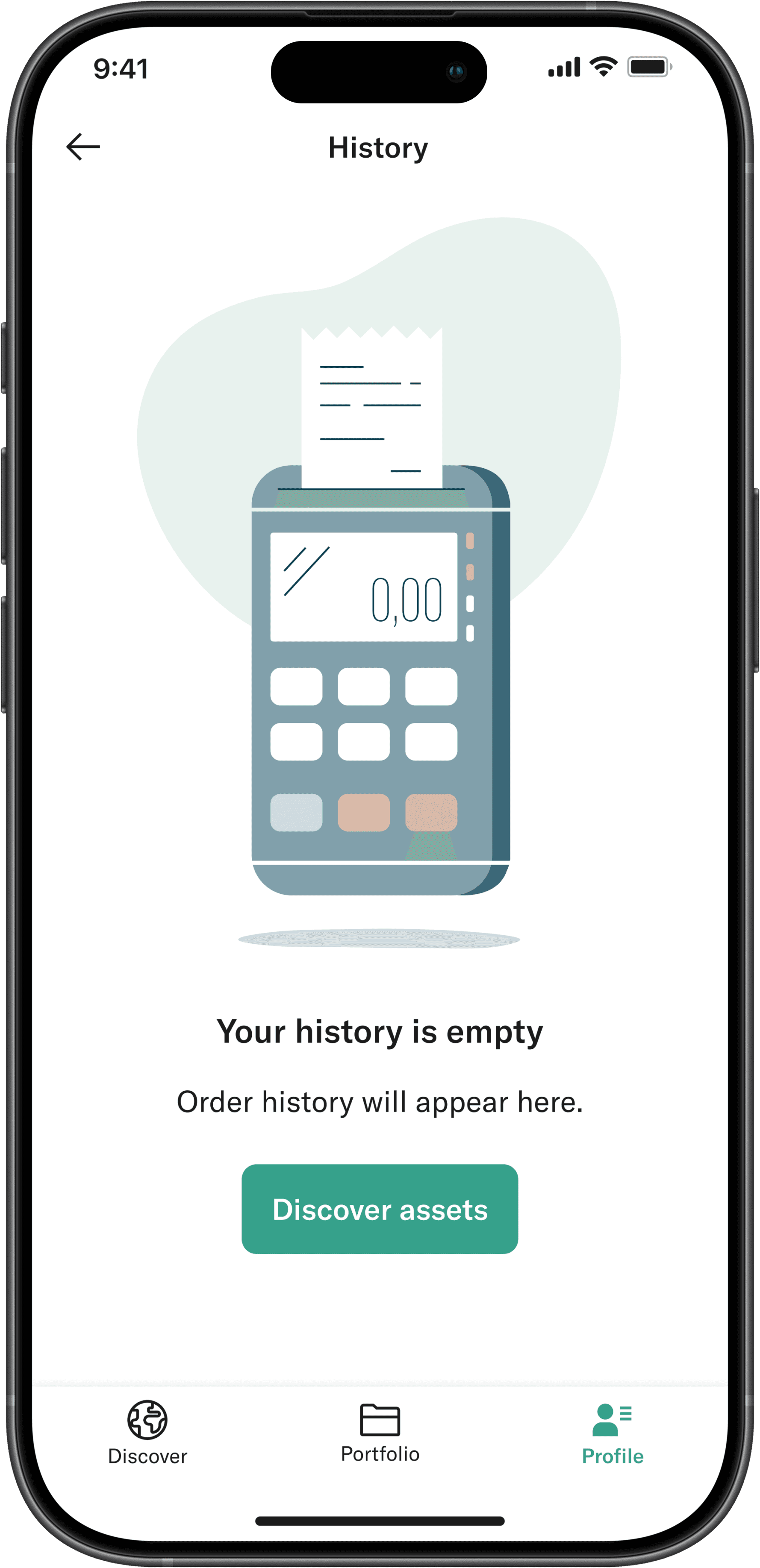
History of orders + empty state
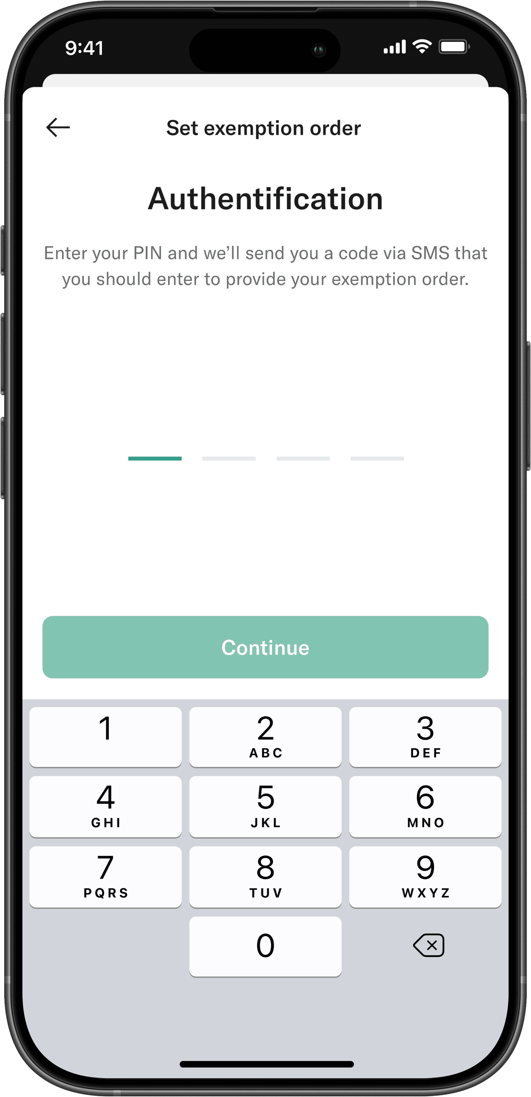
Tax-related actions require more explanation, but also more care. Users need clarity without being overwhelmed by legal detail.
The exemption order flow was designed to be linear and predictable, with clear language, step-by-step guidance, and immediate feedback. Contextual explanations appear exactly where questions are most likely to arise.
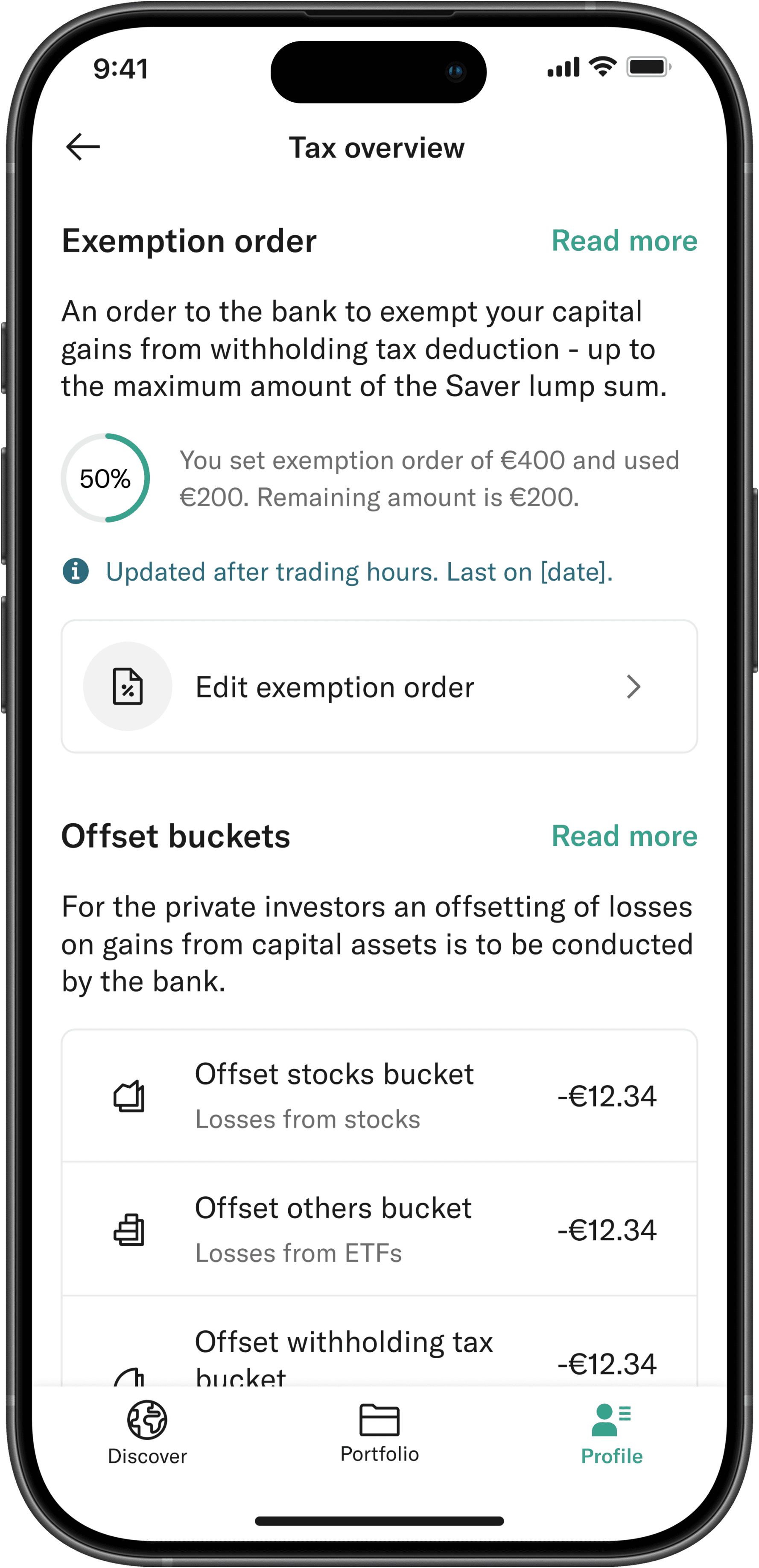
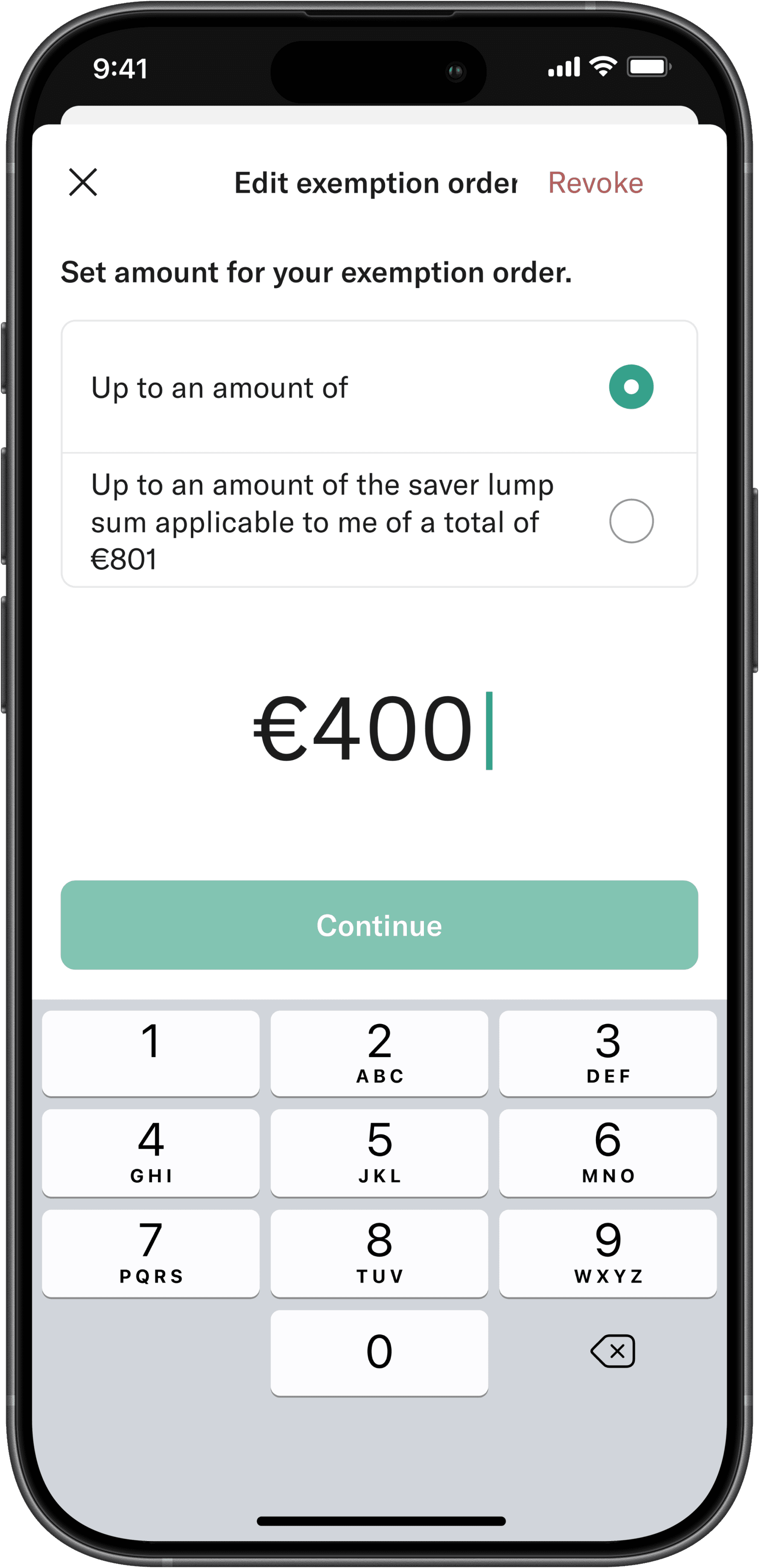
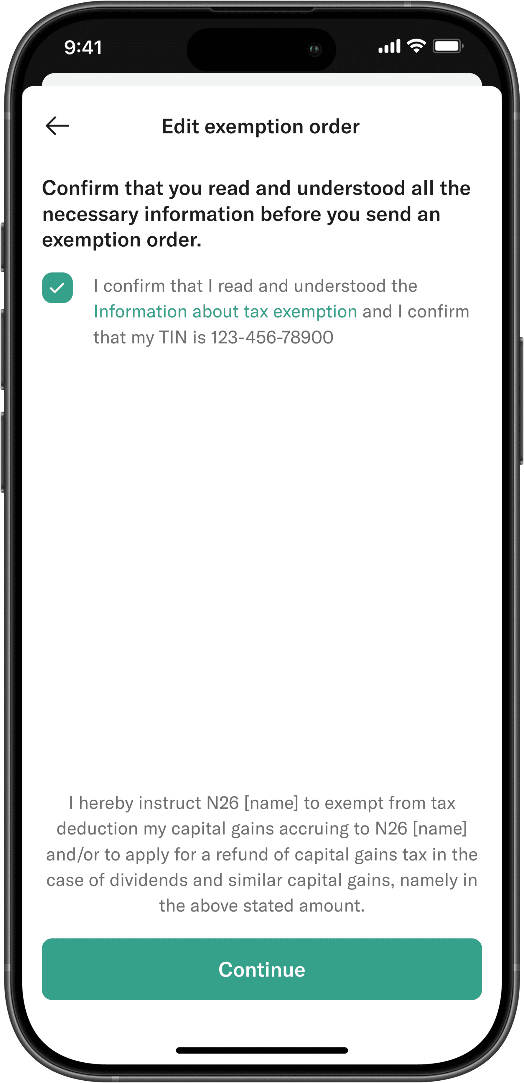
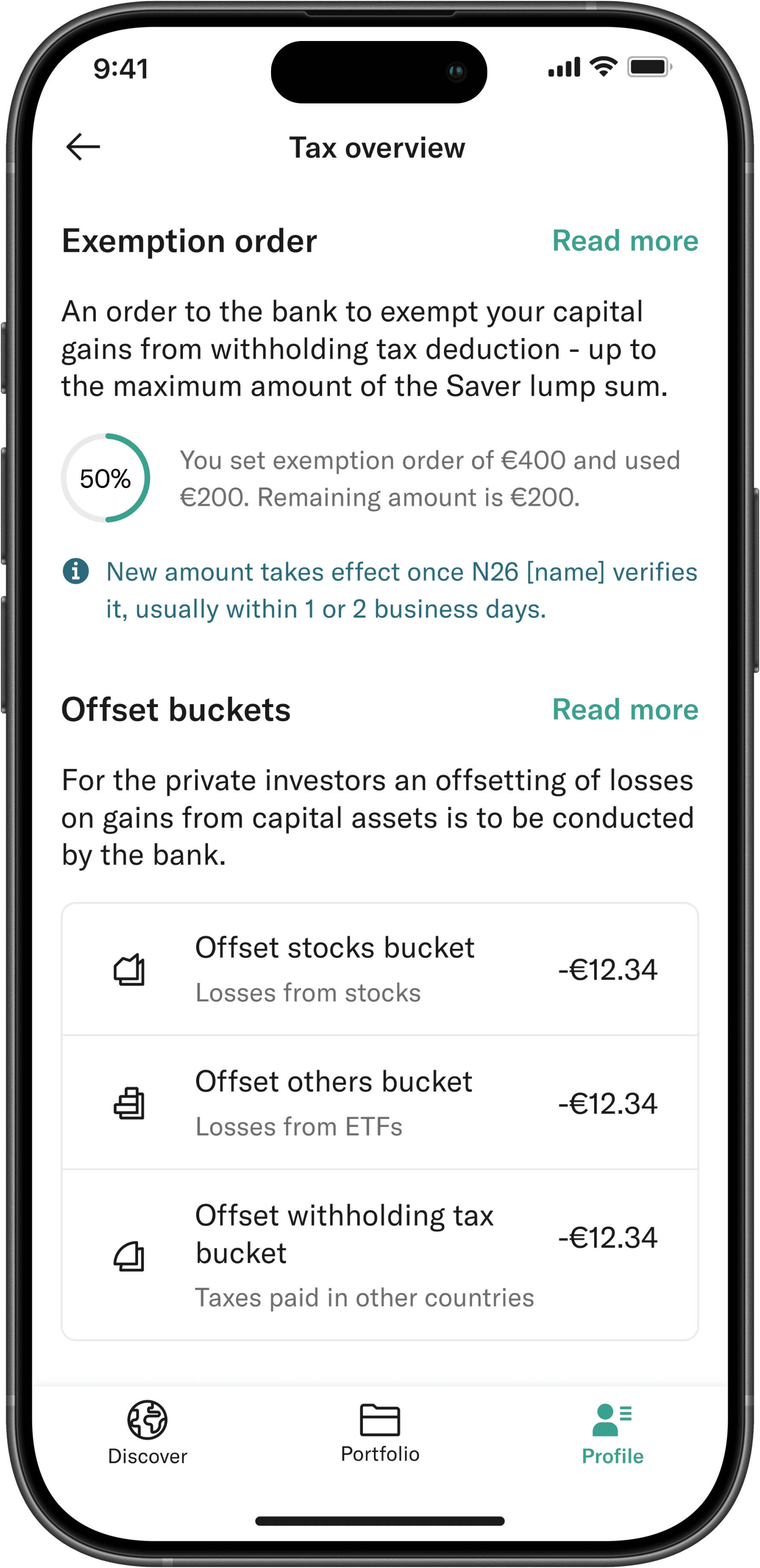
Exemption order flow
Outcome: Users can understand what has already happened, what is currently in progress, and what will happen next, without needing to interpret legal language or guess system behavior.
This reduces uncertainty in areas where anxiety is usually highest, and helps maintain trust even when dealing with complex tax-related flows.
A significant part of the work focused on the design system that supported the trading product. My responsibility was to ensure consistency, scalability, and clear rules that development teams could rely on.
I worked on defining component structures, layout patterns, spacing rules, and interaction behaviors that could handle complex trading flows without becoming inconsistent over time.
This was especially important in areas like order placement, status handling, and reporting, where small inconsistencies can easily lead to confusion or loss of trust.
The goal was to build a system that stays out of the way and allows complex functionality to feel predictable and stable across the product.

NXD Design System Preview
Although the product did not reach public release, the work established clear UX foundations for stock and ETF trading within N26.
The design aligned trading with N26’s existing banking and crypto experiences, reduced cognitive load in high-risk flows, and introduced patterns that balance speed with safety.
During development, N26 shifted its strategic priorities and the project was discontinued. The work documented here reflects real design decisions, collaboration, and constraints up to that point.
Working on N26 Trading changed how I think about complexity in product design. It made it very clear that clarity is not about hiding information, but about knowing when and how to reveal it.
Designing trading flows meant dealing with real consequences. Every screen, label, and interaction had the potential to influence a financial decision, which pushed me to be more intentional and less decorative in my approach.
The project also moved me much closer to engineers, data teams, and compliance stakeholders. Understanding how systems, regulations, and edge cases interact became just as important as the interface itself.
Even though the product did not launch, the work strongly shaped how I approach product design today, with a focus on restraint, clear priorities, and user trust over feature depth or visual noise.