Introduction
OTP Banka is one of the major banks in the region, with a strong push toward digital services. Their mobile banking app plays a key role in how clients manage their finances day-to-day — from checking balances to making payments and opening savings products. While the app was packed with features, it hadn’t been properly reviewed from a UX perspective in quite some time.
I joined OTP Banka to help improve the app’s overall user experience. My task was to take a fresh look at how the app worked, identify pain points, and suggest practical design improvements.
The challenge was to dive in quickly, assess what was working and what wasn’t, and come up with realistic design recommendations that the team could act on.
Research & UX audit
To get a full picture of how the app was performing from a user experience point of view, I started with a UX audit. This included a mix of hands-on testing, design evaluation, and discussions with internal teams. Since we didn’t have direct access to end users during this phase, I relied on expert review methods and stakeholder input based on recurring customer feedback.
What I looked into:
Heuristic evaluation: I reviewed the app against UX best practices to spot common usability issues (things like unclear navigation, inconsistent feedback, or confusing error states).
Visual consistency: I went through screen-by-screen to check for inconsistencies in typography, spacing, colors, icons, and component behaviour.
User flows: I mapped out key flows to see where users might get stuck or frustrated.
Competitor scan: I also looked at a few competing banking apps to see how OTP’s app compared in terms of structure, design patterns, and overall usability.
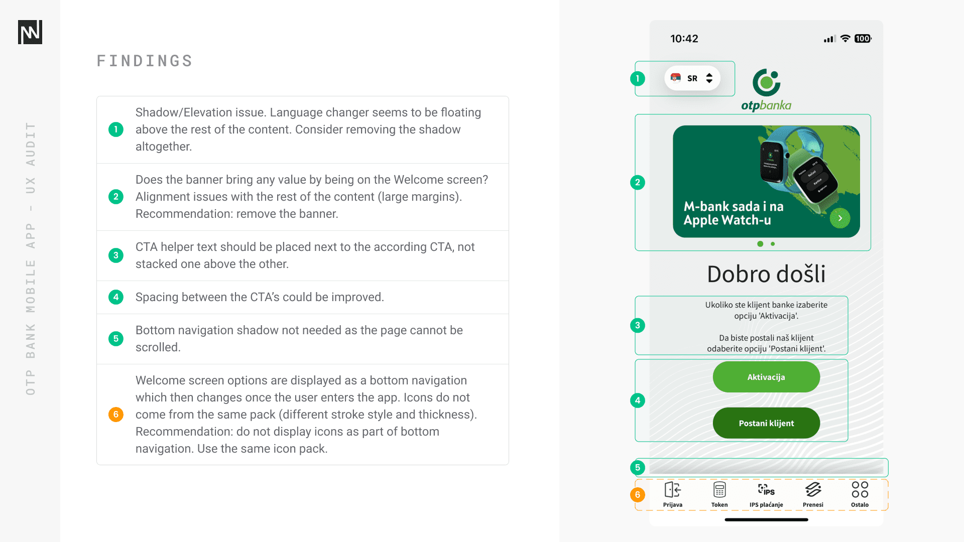
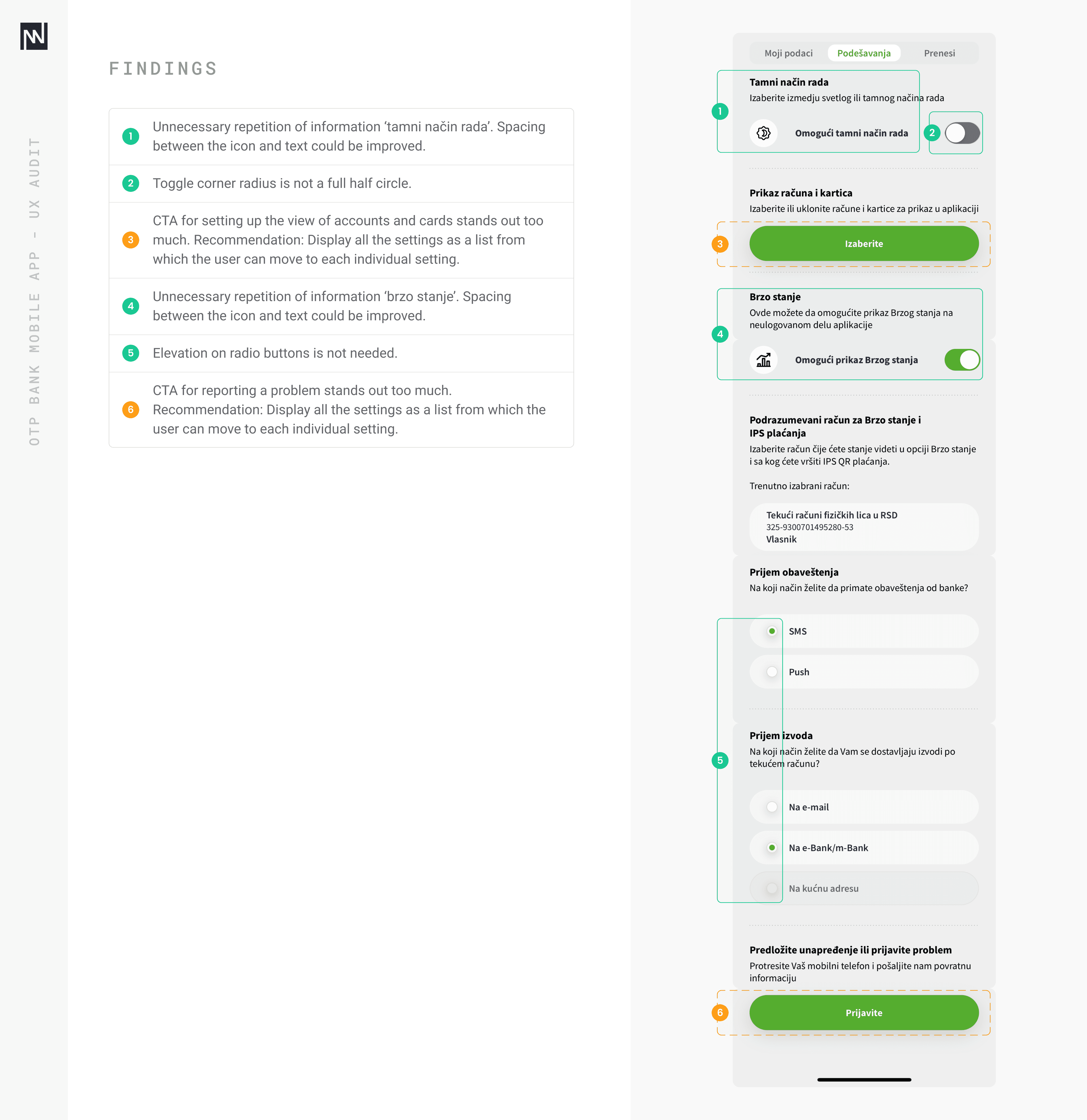
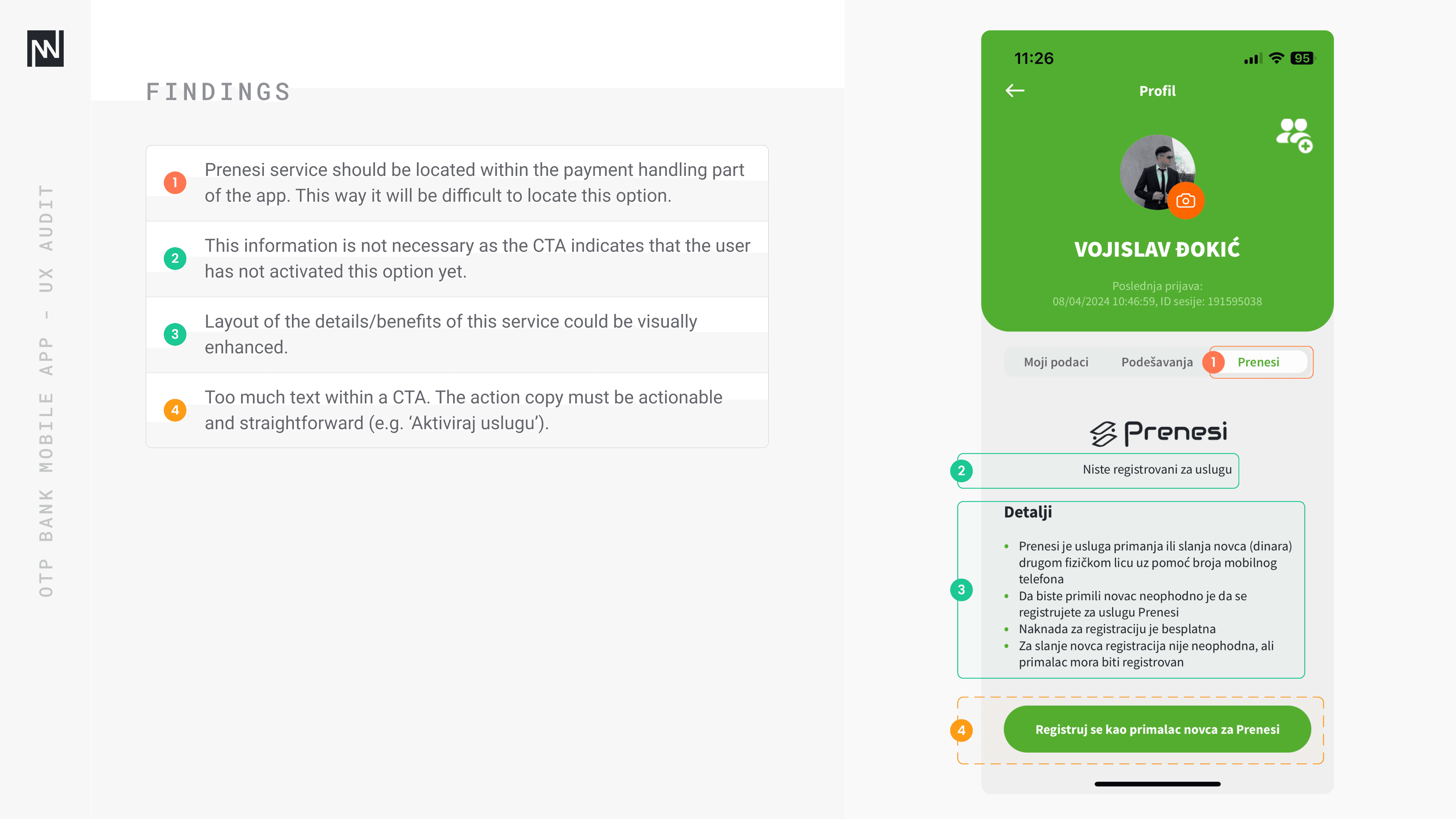
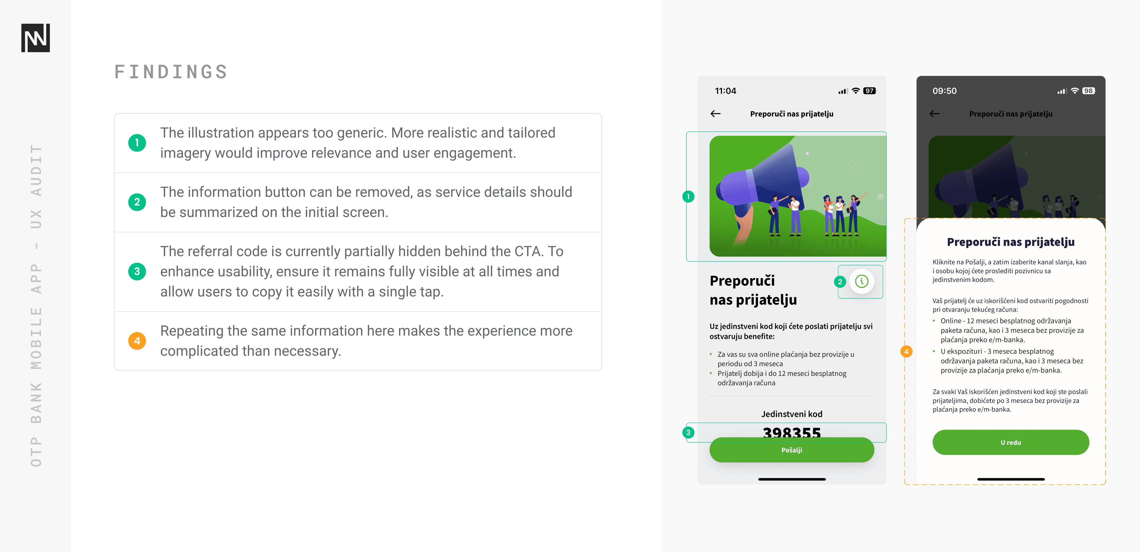
Below are selected screenshots from the audit, annotated with this severity system to show the range of issues found — from quick wins to more urgent experience blockers.


After reviewing the audit with stakeholders, I proposed a restructured IA that simplified navigation, grouped related tasks more logically, and prioritized features based on user needs and frequency of use.
Below: my proposed IA, designed to reduce cognitive load and make high-frequency actions more accessible. This version was presented and refined with stakeholder feedback.

Redesign & Recommendations
Once the proposed IA was validated with stakeholders, I moved into creating design recommendations and redesigning key screens and flows. The goal was to make the app feel more intuitive, reduce user friction, and visually clean up inconsistencies that were uncovered during the audit.
This phase included:
Updating screen layouts based on the new IA
Improving the hierarchy of information and actions
Enhancing visual consistency across screens
Simplifying user flows for key tasks (e.g. payments, onboarding, savings setup)
Applying usability best practices in navigation, feedback, and error handling
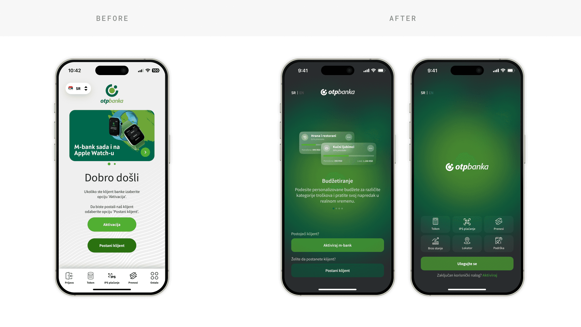
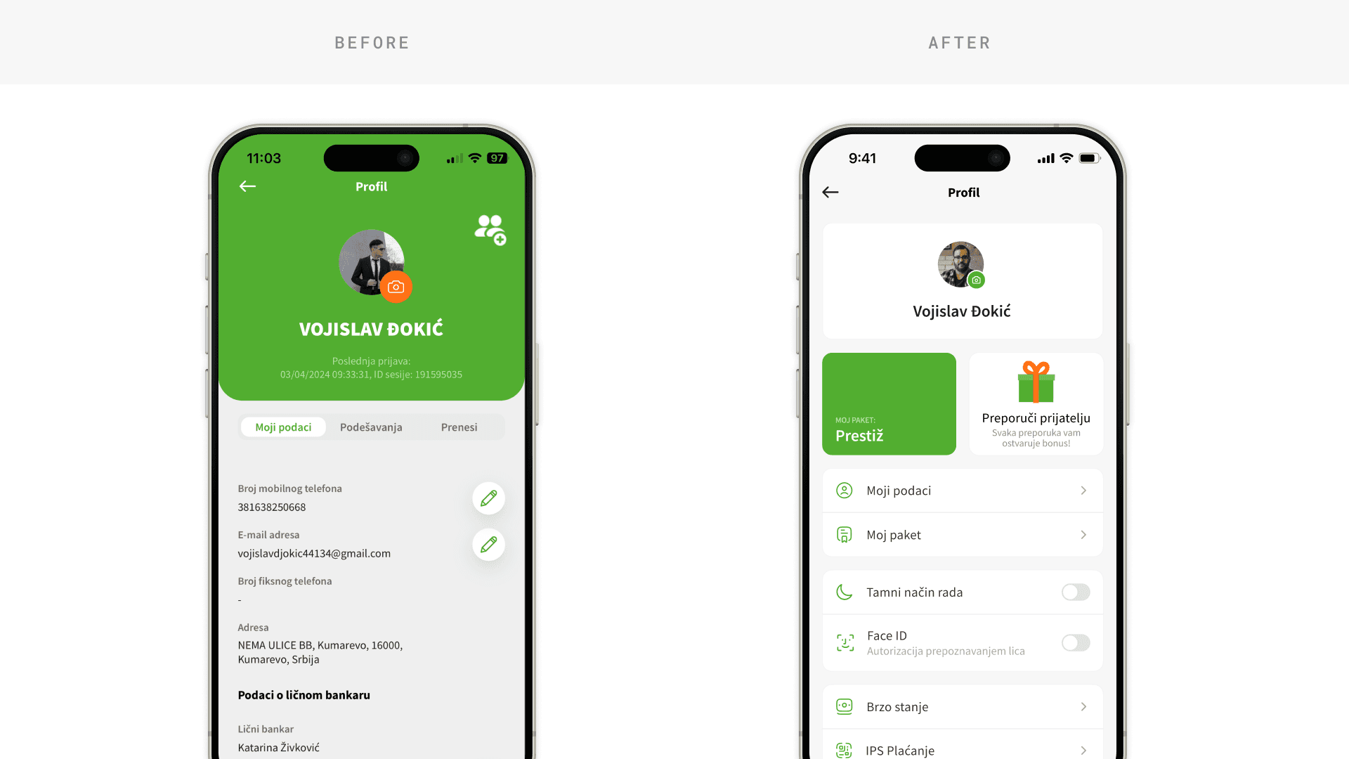
Below are a few selected examples comparing existing screens with redesigned versions, based on insights from the UX audit and the updated information architecture. While several complete user flows were redesigned, I’m only able to share a limited number of screens due to NDA restrictions.


Outcome & Learnings
The UX audit and redesign work helped OTP Banka take a step back and re-evaluate how their mobile app serves users — not just visually, but structurally and functionally. The insights and design updates I provided laid the foundation for a more intuitive and consistent experience, particularly across some of the app’s most frequently used screens.
Although implementation was still ongoing when my engagement ended, early feedback from internal testing and stakeholder reviews pointed to a clear improvement in usability.
Key Takeaways
A well-structured UX audit can uncover not only visual inconsistencies but also deeper flow issues that impact user confidence and task success.
Even in a short engagement, focusing on high-impact areas can drive real usability gains.
Communicating findings clearly, using annotated screenshots, severity levels, and side-by-side comparisons helped build alignment and trust with stakeholders.
Collaborating with internal teams and working within realistic constraints (including brand guidelines and technical limitations) was key to making progress quickly.
This project reinforced the value of combining quick wins with long-term structural thinking and reminded me how even small design shifts can make a big difference in the daily lives of users.